Hues, shades and saturation influence our buying and eating habits more than we think. Designer Sarmishta Pantham knows this, and shows us how it works.
Raging with nostalgia-fuelled craving on a cold Berlin winter night, I set out to make kesari for the first time – merely a modest pudding elevated to sublimity with the golden touch of saffron.
I diligently soaked strands of kesar – the saffron that gives the dish its name – in warm milk for an hour as the recipe advised. An hour later, I discovered that it did practically nothing to the milk. The liquid was an insipid yellow, with none of the golden glow I had fantasised about. Half-resigned to my fate, I stirred the rava into a heated pot, unable to escape last-minute deliberations about whether or not to give it my all by throwing in the rest of my saffron stock. Tasting my wan kesari only damaged my nostalgia further.
Yes, colour has the power to let us down from the dreams of a simple kesari, and the power to make us feel empowered, the power to fake it, and the power to make it.
As an expat with little access to otherwise fairly boilerplate Indian foods, I was forced to contend with the gnawing theory that the washed out colour of my preparation had let me down from sating a craving. I sat with that for a bit, and decided to bring out the big guns: orange food colouring. I won’t say that the industrial tint fixed the problem. It appeared that, somewhere between the rounds of matching taste with the colour, I’d lost the plot.
Colour is a tease. Swaying between the precision of language and the abstraction of imagination, colour plays a starring role in how we make sense of the world around us, however subliminal. “Colour feasts the hungry eyes that look around in the world’s kitchen looking for more vision food,” said Karel van Mander, the Flemish painter and art historian from the 1500s. When we pair the visceral quality of colour with something as primal, fundamental and essential in our lives as food, the result is a potent mix that confronts us on the everyday. Yes, colour has the power to let us down from the dreams of a simple kesari. Colour yields the power to make us feel empowered, the power to fake it, and the power to make it.
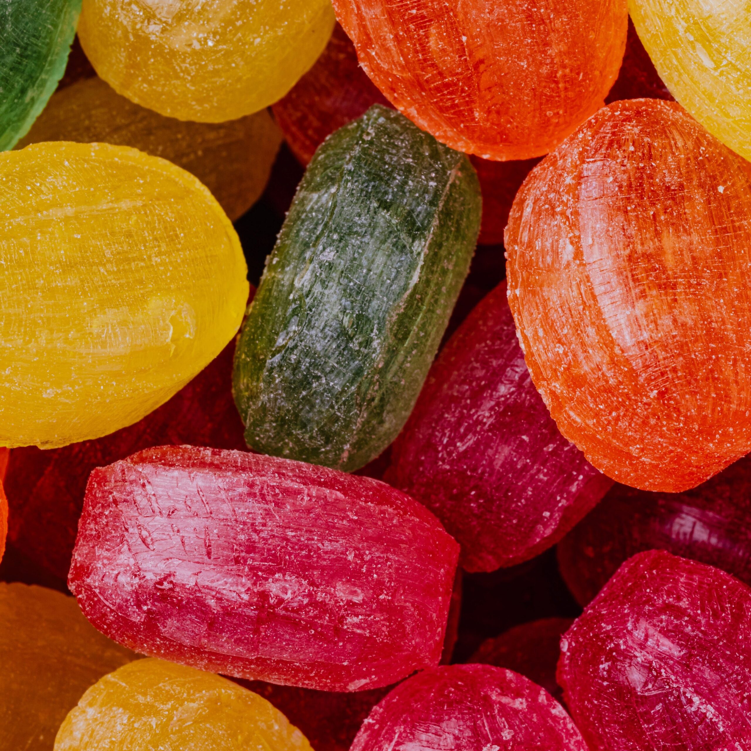
The modern world is full of carefully established colour-to-taste conventions that have been fine tuned to perfection over the ages. Our childhood delight of peeling back the wrapper of a Poppins roll to reveal its much-coveted tower of colourful tabs was arguably our first lesson in colour and taste association. When bright new dyes were first invented in the early 1900s, the earliest adopters were confectioners. Innovating with artificial flavours, they needed a signpost to make their inventions conceptually cohesive. Thus began the associations: yellow means lemon, orange means orange, and so on. And what a great lesson it was, because everyone had their favourite Poppins colour!
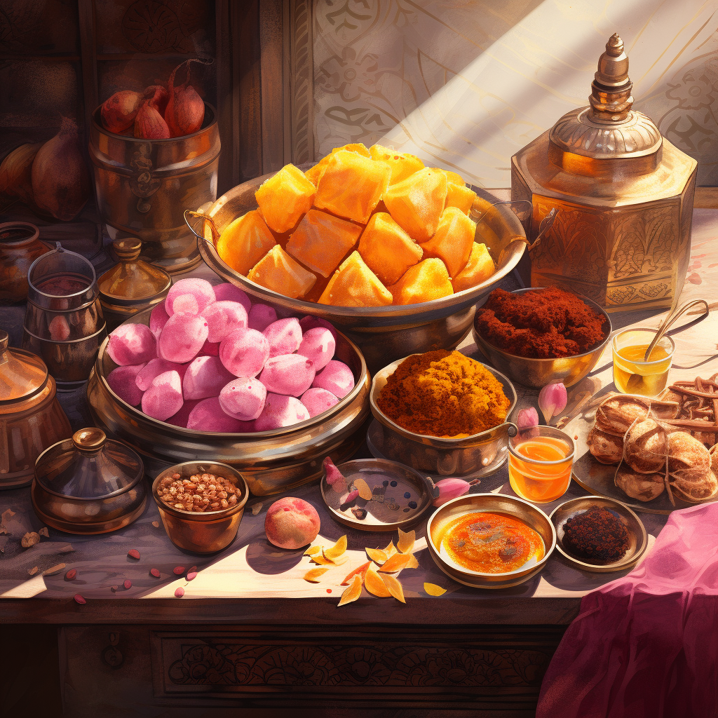
Today, it matters little that kala khatta tastes like real jamun, but the very association we make with its deep, rich hue and the perception of the smallest shred of jamun is enough to get us salivating. And what’s more, we’re deeply uncomfortable when we’re unable to interpret a colour in a food – like guessing what the infamous TikTok rage, Pink Sauce, might taste like.
Colour has since become the vehicle to assign the perception of flavour and to deepen it. US-based Hercules Candy plays on the very concept by reverse-engineering it: consumers are tickled by the challenge of identifying the flavours in their colourless “mystery” candy bags.
Alongside the invention of artificial dyes came the rise of packaging and colour printing. Packaging meant one could no longer touch or smell their food before purchase. Affordable colour printing meant magazines were chock full of potential for colour ads. With the commoditisation of food, businesses shaped the expectations of our food further by meticulously designing its proxy– the packaging.
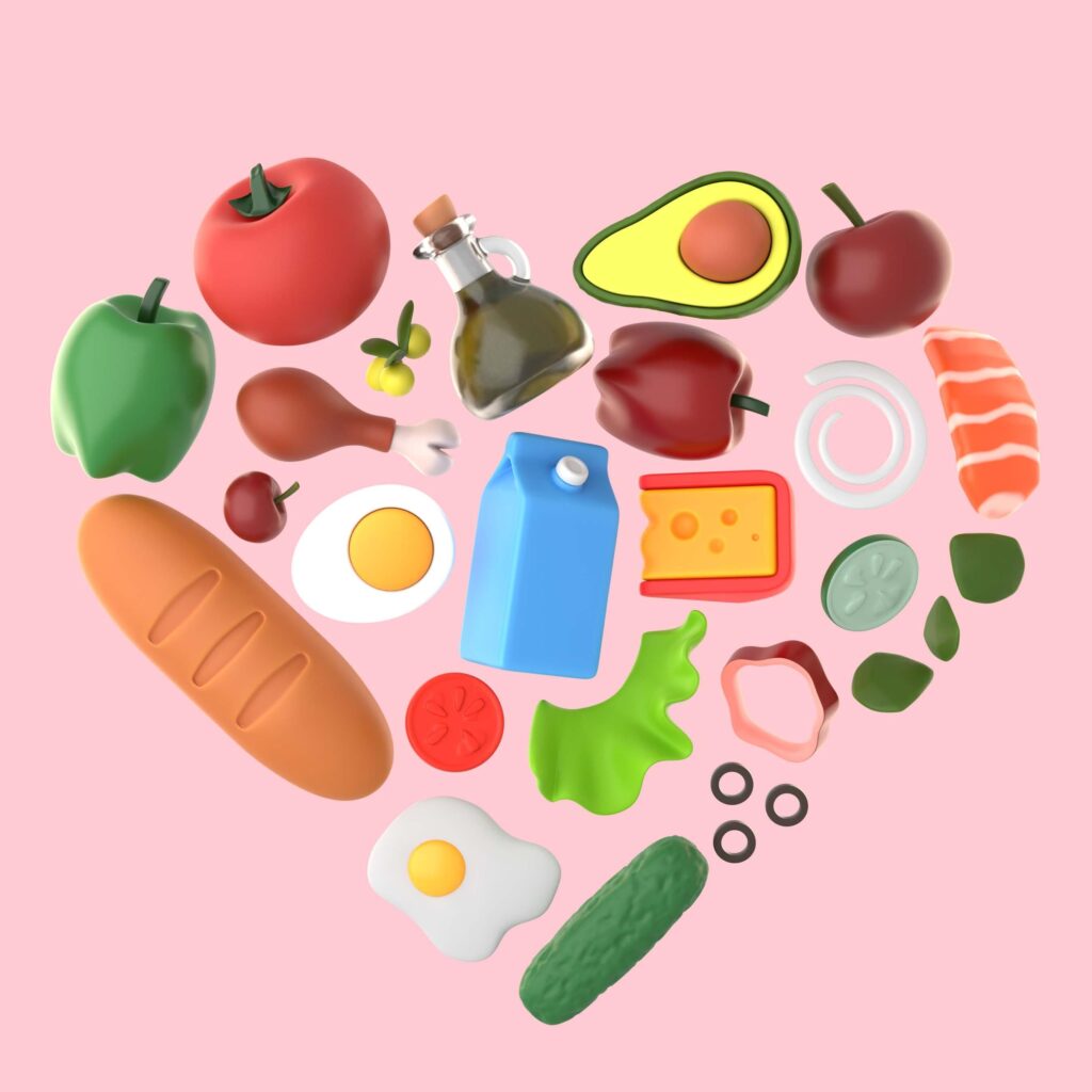
Several studies have proved that the colour of our food packaging drives between 60 to 90 percent of our purchasing decisions. For designers, the holy grail lies at the elusive cusp of creating novelty while keeping with established colour associations. Kurkure, the lesser radioactive-coloured desi cousin to Cheetos, still screams ample energy. Warm, fiery tones clash with bright greens from the opposite end of the colour wheel on tinny snack bags. Such is the code for representing savoury tastes, even a food tourist can call it. Desserts, baked foods, and sweets, meanwhile, inhabit the other end of the spectrum– pinks, pastels and comforting hues act as visual precursors to the squishy, soft, tender textures and tastes to come.
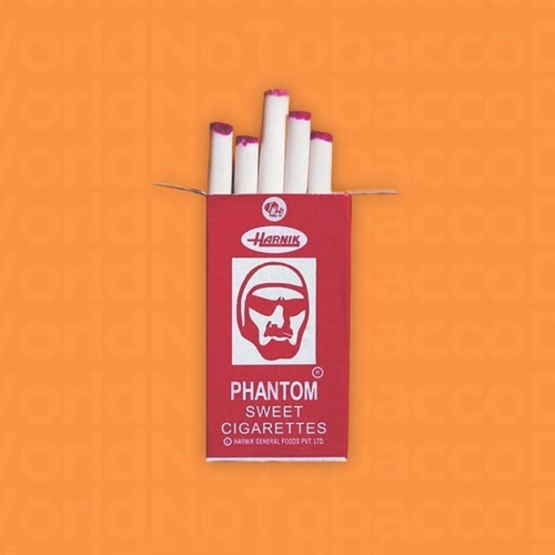
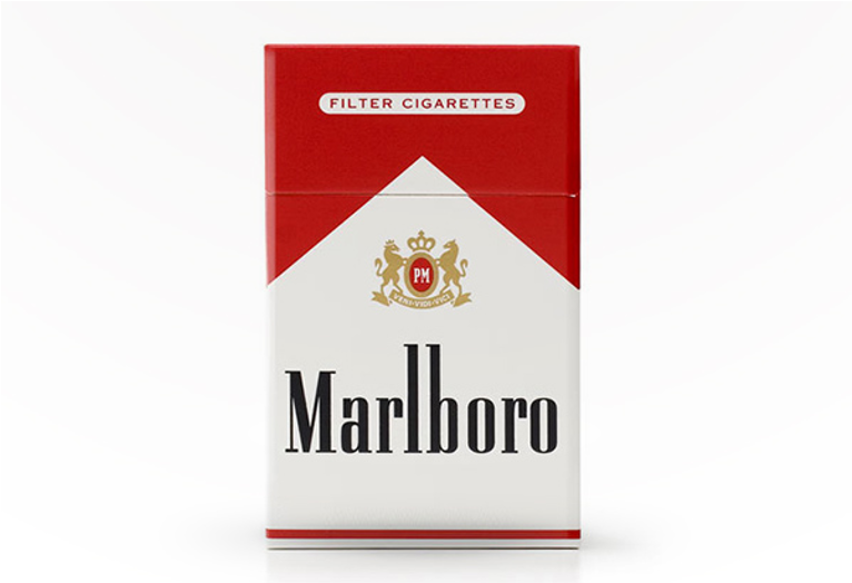
To be sure, the power of colour can go well beyond desire. Colour helps us fantasise. A packet of the infamous Phantom cigarette candies in your pocket and there you are, feeling like Chiranjeevi, Rajnikanth, Mithun da, John Wayne, or whoever you dream of. Whatever your flavour of macho, the colour is white as a crisp ciggie – as it should be. Packaged in red and white boxes designed to mimic the Marlboros and Lucky Strikes of the adult world – bold, masculine, and provocative, the candies themselves were intentionally devoid of colour save the glowing red “ember”– a rare colour choice with a precise intent. And the kids ate it up. For those that didn’t want to go that far, Pan Pasand offered a cheeky shortcut into the pan-chewing grown-up club with the red tongue effect.
As food is further pushed into becoming a packaged, advertised commodity, colour is not just branding, but a key product feature evolving in our collective psyches. The iconic yellow-red-white palette of Parle-G and Maggi, conventionally akin to the language of hunger-inducing, impulse-buying fast-food brands, has evolved from implying plain bait to familiarity and comfort.
Of all the things to reign on the mighty internets, food has clawed its way to the top, thanks to social media. “Because of the camera, the painting now travels to the spectator rather than the spectator to the painting… In its travel, its meaning is diversified,” observed John Berger, English art critic, novelist, painter and poet, in his seminal work, Ways of Seeing. He was examining the role of printing technology in how we viewed art.
While colour photography helped disseminate the technicolour dream of modern food inventions: artificial flavours, colours, and packaging in the last century, the smartphone has started to transform the way we eat. Every pocket now has a camera, and meals travel to spectators away from the scene as images of colour and shape; devoid of the other senses: smell, touch, sound, and taste.
Colour dons the mantle of hedonism, creating shock, appeal, love or repulsion; with context serving at its disposal. We may be what we eat – but we also eat so we become.
Never mind its taste, its colours have to pop, food has to be Instagrammable. And while chefs are at it, food also demands that restaurateurs design spaces with colour and lighting geared towards the end result: great photographs, going viral, reaching more audiences. While food has been associated with hedonism across cultures and eras past, we have never been more preoccupied with the perception of hedonism as we are now. Colour dons the mantle of hedonism, creating shock, appeal, love or repulsion; with context serving at its disposal.
We may be what we eat – but we also eat so we may become. The rising crescendo of multicolour palettes came to a seemingly bottomless fall with the pandemic as we found comfort in restraint – our home kitchens were taken over by the ecrus and beiges of banana breads, pressure cooker cakes, and sourdoughs. Here, colour spoke for our longing for a picture of quarantine that was more calming than terrifying. Colour became comfort.
Our relationship with food is one of our most intimate relationships, the colours we identify with in our foods and into our bodies is a primal language – one that reveals how we feel and how we want to feel. As we come out of the lull of the pandemic into times of much-needed, albeit, cautious optimism, where are we heading to next? Stripped of all form, colour is a quiet marker of our time, a whisper we can catch if we listen closely.
